Transparency effects in Illustrator (part 1)
1
As already known, the iStockphoto stock photo site has recently started accepting vector illustrations in AI and EPS 10.0 formats. This opens up new opportunities for illustrators, one of which is the use of transparency effects. That is what will be discussed further.

Most of us are used to working with the capabilities provided by AI 8.0, so getting used to AI 10.0 may take some time. For example, many have forgotten what transparency is and how it can be used.
To reintroduce some cool transparency effects, this article was written.
Transparent objects in Illustrator
Anyone who previously had to split objects into parts to create a fake transparency effect is pleased that true transparency can now be used when creating vector files.
To begin, take a look at the Transparency panel in Illustrator. It can be found via Window > Transparency or by pressing Shift+Command+F10.
To make a shape transparent, draw several objects on the artboard and overlap them. In this example, simple circles were used.
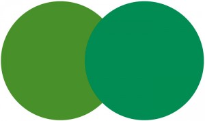
Select both paths and in the Transparency panel reduce the Opacity percentage. It will be seen that the shapes start showing through.
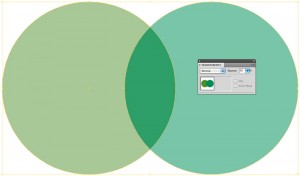
There is also a dropdown menu in the panel. This allows various transparency effects to be applied to shapes, such as Multiply, Overlay, Screen, and so on.
Observe how each transparency effect behaves and imagine how it can be used in projects. Here are several examples; pay attention to the overlapping areas to note the differences.
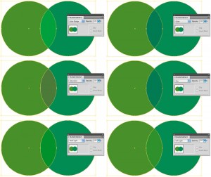
Pros: In AI 8.0, to achieve a similar transparency effect, it would be necessary to create 3 different objects: one for each circle plus a separate path simulating transparency. And the more complex the shape, the harder it becomes to make edits later.
Cons: Transparencies can be risky in print because not all software supports them. However, risks in printing can be reduced at any time by converting transparency to spot colors in any suitable program, such as Corel.
Shadows in Illustrator
Wasn’t there a struggle with blends and meshes to simulate a shadow in AI 8.0? Well, that is no longer necessary. Now the built‑in Drop Shadow effect in Illustrator can be used to add depth to artwork! Here is how.
Draw a shape. A circle was used again. Select it, then go to Effect > Stylize > Drop Shadow. This brings up the Drop Shadow dialog.
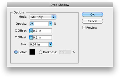
If there is a need to preview the result, check the Preview box on the right. From here, simply watch what is being done until the desired effect is reached.
It is possible to adjust the shadow color, the offset from the object, how dark it is, and how sharp its edge appears. Unlike AI 8.0, this takes just a few seconds.
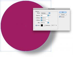
Pros: The shadow effect is transparent; it will be visible on any colored background as well as on plain white.
Cons: The shadow effect cannot be edited in any program other than Illustrator. It will rasterize, while all other objects in the vector file will remain editable. Also, mixing gradients and shadows can cause major technical issues, so for maximum compatibility it is preferable to use shadows only on solid colors.
The transparency effects continue…
This article is available in the following categories: About Microstocks, Istockphoto


