Transparency Effects in Illustrator (Part 2)
1
Today is the continuation of the article on transparency effects in Illustrator that I started publishing in December.
Glow and Feathering
Shadow is not the only effect hidden in the “Stylize” menu. If you go back there again (Effect > Stylize), you will see options for adding feathering, inner and outer glow.

They don’t look very interesting when applied to circles, but when it comes to more complex shapes, these effects can save you a lot of time compared to working in AI 8.0.
Pros: Glow and feathering are a simple and quick way to make changes to your illustration.
Cons: Like the shadow effect, glow and feathering will be rasterized if you open the work in any other program, although they still print well.
Transparent Blends and Gradients
One of the coolest features of Illustrator currently implemented is the ability to create transparent gradients. Remember how hard it was in AI 8.0 to create an object’s reflection using a gradient fading to white? Everyone remembers how terrible it looked when placing an object with such a reflection on a colored background?
Great, now you just need to create a gradient that fades to 0% opacity. It will look great on any colored background.
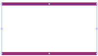
We start with a simple line filled with purple. Copy and paste this line onto itself and move the copy away from the original (in any direction, we chose upward). Select both paths, then go to Object > Blend > Make.

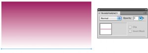
Using the Direct Selection tool (white arrow), select one of the lines in the blend. We used the lower line. Once selected, go to the Transparency palette and change the opacity percentage to 0.

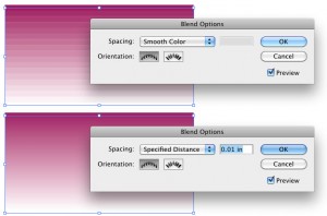
If your blend looks uneven, you need to increase the number of “steps”. To do this, go to Object > Blend > Blend Options.
Change the Spacing method to “Specified Distance” and enter a small number, for example, 0.1 mm. This will smooth your blend so it does not look so uneven.

Pros: For effects like the hugely popular “shiny floor,” transparent blends are simply indispensable. They look great on any colored backgrounds, not just solid white.
Cons: These effects can look very strange in Corel, like fragmented paths, especially if used together with gradients. We recommend using opacity in blends carefully and trying to avoid placing them over gradients.
Opacity Mask
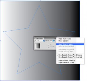
Another way to create a transparent gradient is by using an opacity mask. To do this, draw two shapes – one over the other. We used a star and a square.
Change the fill of the lower shape (square) to a gradient from white to black, and remove the stroke.

Then move the star behind the gradient square. The star will be the object that fades out, and the square will serve to create the gradient mask.
Select both paths. In your Transparency palette, choose “Make Opacity Mask” from the dropdown menu located in the upper right corner.

Voila, now you have a star that gradually disappears. We also used a background to show you the transparency.

Pros: Opacity mask is a simple and fast way to make an object fade out unlike linear or radial gradients.
Cons: Since you can create only radial or linear gradients, this effect is not as versatile as, say, blends with opacity. Also, like most Illustrator transparency effects, it’s better not to use this mask with gradients, so try to stick to placing the mask on a solid fill.
Note
Transparency effects in Illustrator, besides being wonderful, can be quite tricky to print, especially when it comes to color blending. So if you decide to use them, please make sure to mention this fact in the image description that you will upload for earning on stock photo sites.
This way, customers will know what they are getting and whether they should purchase the illustration and if they can use it in their work. Add all possible information to the file for those who wish to buy illustrations on stock photo sites. How the file was constructed, which Illustrator transparency effects were used and in which parts of the file, which palettes you used, and also the file’s color model type.
You may also consider including a version without transparency usage in your “Additional Formats” folder, just in case.
Author: bortonia (Jennifer Borton)
Link: www.istockphoto.com/article_view.php?ID=1267


