Vector Illustration Best Practices (Part 1)
3
Every microstock contributor submitting vector illustrations has likely encountered rejections such as, “We are very sorry, but this file is not suitable for our photo bank. Due to the rapid growth of our collection, we review each submission carefully but can’t accept them all.”

Such rejections are particularly frequent at iStockphoto and are referred to as non-compliance rejections. Generally, non-compliance means your work has elements that prevent its acceptance into the photo bank’s collection.
But what does this actually mean? What constitutes non-compliance? To demonstrate this kind of non-compliance rejection, microstock inspectors from iStockphoto provided two vector illustrations of the same subject.
The first vector illustration shows an unsuitable or non-compliant result for the iStockphoto photo bank. This is precisely the situation where it is easier to demonstrate errors and comment on weaknesses in the illustration than to explain in words.
In the second illustration, errors or non-compliance have been corrected, making it suitable not just for any photo bank, but for a demanding one like iStockphoto.
In most cases, this non-compliance does not relate to the concept of your illustration and the objects as a whole. Rather, this non-compliance shows how well you handle the task. Every small decision, sometimes even one that no one pays attention to, will affect the result of your work.
Now, let’s explore what, according to iStockphoto’s microstock inspectors, distinguishes a ‘good’ vector from its non-compliant counterpart.
Key Details in Vector Illustrations
In the early days of vector art, previews were limited to small, 270-pixel images that couldn’t be enlarged. However, those days are over, and now vector illustrations feature previews that can be enlarged like photographs.
However, the downside is that your illustrations are now scrutinized more closely. Therefore, you need to examine your work closely before uploading it to the photo bank.
So, are the curves in your illustration smooth or angular? Do the outlines of objects carefully touch the edges of one another, or do you leave flaws in haste?
Sometimes, a buyer’s positive impression from a vector preview disappears as soon as they take a closer look at the original. Indeed, as surprising as it may seem to some contributors, buyers are adept at identifying subpar work.
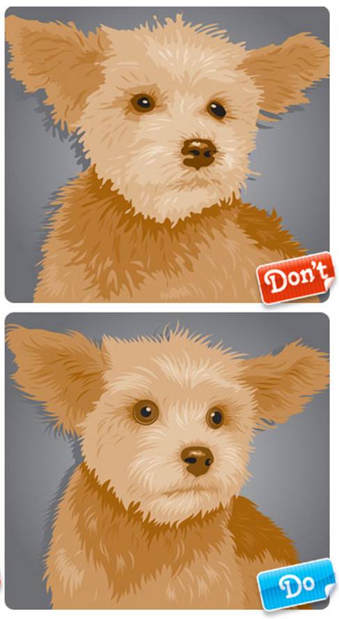
At first glance, the illustration appears appealing in the preview (what a cute little dog!). However, upon closer inspection, several issues become evident. The dog’s fur appears matted, as though it hasn’t been groomed.
The outlines of objects overlap, leaving gaps, and the eyes are poorly rendered. These flaws signal to the buyer that the work is substandard and suggest a lack of proficiency with the Pen tool. The fur should not appear dirty or stained.
In contrast, in the second illustration, the dog appears much neater when zoomed in. After addressing all the flaws identified in the first illustration, the dog’s fur is now smooth, with each strand ending in a neat, sharp tip. The eyes are perfectly round, and the dog’s cute whiskers are clearly visible.
A photo bank buyer is unlikely to choose the first illustration since it has numerous flaws. Meanwhile, the second illustration of the dog is ready for acceptance into the iStockphoto photo bank collection!

WORKING OUT VECTOR DETAILS
If you think meticulous details are only important for images on paper, you’re mistaken. Attention to detail is crucial regardless of the medium or subject, even for simple seamless patterns. Microstock inspectors assess the neatness of execution in vector illustrations during the acceptance process.
Without zooming in, the first illustration appears similar to the second. However, upon closer inspection, it’s evident that the first is a rough draft that even a lenient teacher would not grade. It seems that insufficient time was dedicated to creating this illustration.
The lines in the illustration are jagged and lack smoothness, making the overall appearance sloppy and untidy. Observe the bud: the spacing between the petals should be consistent, but here it is irregular. Neglect will further deteriorate this already unhealthy plant. The entire illustration resembles an unsuccessful auto-trace.
From a distance, the second illustration does not differ significantly from the first. But what happens when we use zoom? Here we see that the first pattern looks like its creator had a bit too much to drink at last night’s party, while the second pattern was created by a true master of their craft.
In the second illustration, the curves are smooth, the distances between the petals are consistent, and the tips of the leaves are well-defined and sharp. The shapes of the inner and outer curves perfectly mirror each other. The contour never intersects. Very good work!…
Now you can rightfully head off to the party.

LINE WORK
In Adobe Illustrator, there are several default settings for outlines, although if you wish, your lines can have any thickness. The editor allows you to draw various lines that resemble those drawn with paints or chalk!
However, it must be acknowledged that many designers spend years using only the default settings in Illustrator. To rise above this template crowd, you need to elevate your work with lines to a new level.
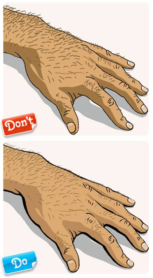
Looking at the first piece, it’s not that bad. Good proportions, decent detail, and even the colors are quite acceptable. But it could be so much better! Notice that all the outlines and elements created with lines are the same, flat, boring, with rounded edges.
All lines in the illustration have the same visual weight compositionally. Identical lines are acceptable for various charts or technical drawings, but this is not the situation. Quite often, even in those same drawings and technical illustrations, varying line thickness is used for differentiation. So, such line work as seen in the first illustration detracts from both the style and individuality of the piece.
Now, the second illustration is much more successful. It employs various line settings, with thickness varying from very thin lines to thick ones. The diverse lines in the illustration look more natural.
The thickest outline is around the entire shape of the hand, which adds a sense of generalization and wholeness to the composition. Also, the thickness of the outlines decreases depending on the significance and role of the elements within the composition.
In reality, objects don’t have outlines, but if they did, I am sure their thickness would vary, and the contour wouldn’t default to black. By changing the thickness, color, and shape of the outlines, good results can be achieved.
You can even create your exclusive brushes. Working with lines initially seems quite complex, but it elevates your vector illustrations to a new professional level.

AUTOTRACING
Now I would like to focus on one of the quite common drawing mistakes: issues with tracing utilities. Beginner designers often place high hopes on the capabilities of tracing utilities. Such software is quite simple and doesn’t require much mental strain.
But could it be that this is just the first impression and it’s not that straightforward? Unfortunately, auto-tracing can really degrade the image. To achieve an acceptable result, the original file needs serious processing. More often than not, it will be much faster to trace the image manually.
In the first illustration, you see an automatically traced image of a cowboy on a horse. The contours of the image are jagged and messy, and since the original photo was slightly overexposed, the horse’s neck and the cowboy’s shirt are nearly invisible (notice the head just floating in the air!).
Don’t forget that if your photo doesn’t have good quality, the final tracing result can be terrible, and you will spend a lot of time getting it to an acceptable standard.
The second illustration was traced manually. It took about 10 minutes longer than the auto-tracing of the first illustration. Now, if you take a closer look, the forms in the image are smooth and clear. Plus, the neck line of the horse and the cowboy’s shirt were added, making the outlines more expressive.
The tail and mane were also cleaned up, and the saddle details were simplified to avoid overloading the composition.

COLOR AND COMPOSITION
When creating a vector illustration, a designer makes a significant number of decisions. It’s essential to determine which object will occupy which space and what color fits each object.
On the one hand, the ability to choose gives the illustration a substantial advantage over photography, where the photographer is limited by the viewfinder’s space and their skills in Adobe Photoshop. But on the other hand, the unlimited choice regarding color and composition leads to inevitable mistakes.
This problem is vividly illustrated by the first example. Essentially, the “composition” in the first illustration doesn’t create an atmosphere. The forms in it compete against each other for the viewer’s attention rather than integrating with each other, as should be the case in good composition. Nothing creates a direction for the gaze.
The viewer’s eye simply jumps from object to object across the image space. The situation is exacerbated by poorly rendered elements of the image. A designer looking to acquire such a work will find it challenging to use that background.
A chaotic mess of similar elements placed randomly leaves no chance even to position text.
The second illustration looks more logical. There is a clear movement, and all elements of the composition are tied to one goal – to direct the gaze to the main, central object of the composition – the sphere. The arrows placed on the right not only give us a direction for movement but also add stability and balance to the composition.
The color structure effectively connects and unifies the elements of the second illustration.

Continuation of the article on preparing vector illustrations for microstocks follows…
This article is available in the following categories: About Microstocks, Istockphoto


The dog in the first image looks better. The eyes are more natural. In the second image, there’s clearly something wrong with the dog’s eyes. It seems like someone has poked a finger into the dog’s eyes. That’s why it’s bulging its eyes out. Don’t do that to dogs, even if you’re asked by those completely devoid of artistic taste inspectors from SS! Stay artists, not statisticians.
Andrew, it’s a two-sided coin here. Stay an artist and be hungry (since IS won’t accept it), or be a statistician and make money from iStock.
Hello everyone! The hand of the person is incorrect in both drawings; the depth between the index finger and thumb is incorrect. So both DON’T.