Vector Illustration Tips (Part 2)
1
End of the article on preparing vectors for stock
SCALE AND PLACEMENT OF ELEMENTS
There are many ways to organize elements of composition in the working space of an image. The difference between vector and raster images is that vector images can be altered at any moment; compositions can be supplemented with new elements, or excess elements can be removed.
However, incorrect decisions regarding composition and scaling of elements can render all our efforts futile. In the first illustration, all elements are tied to the vertical and horizontal sides of each other.
This layout of elements creates discomfort and disrupts the viewer’s natural eye flow.
A small space feels more natural when filled thoughtfully. However, the second vector illustration shows poor planning of a large space, with elements haphazardly pushed to the edge and cropped, suggesting a lack of professionalism and understanding of composition.
Elements should not be clustered in the center, as they are in the third illustration. The composition in the third example appears ill-conceived, with a clear lack of prior intent; the objects are placed haphazardly and hastily.

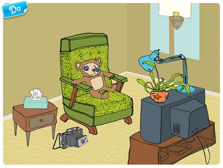
To demonstrate the key points, let’s examine the final, correct illustration. Notice how the elements are grouped into three sections: foreground (television and stand), midground (armchair, camera, and table), and background (basketball poster on the wall).
This grouping creates an organic composition and guides the viewer’s eye through each part of the illustration, as if unfolding a story. Didn’t notice this? Let me explain…
So, the foreground. The elements in the foreground are not too scattered and do not touch each other in random places. A small, noticeable space exists between the armchair and the television, signaling to the viewer that these parts are interconnected but belong to different elements.
Now, the midground. Here, the objects do not overlap, allowing the viewer’s gaze to move freely from the edge of the table to the chair through the camera. However, such a compositional technique doesn’t always work.
The author aimed to provide space without exceeding the means of creating depth.
In the background, there’s just a poster on the wall. However, the lamp, serving as a link between the midground and background, nudges the eye toward the poster.
Thus, the viewer automatically understands that the poster exists; however, it does not serve as the semantic and compositional center of the illustration, and the viewer’s gaze quickly returns to the foreground.

Mastering Proportions in Vector Illustrations
Styling and exaggeration of the human figure are common practices, and leading stock agencies approve their use in works. But remember, everything should be done in moderation! Styling is also subject to the basic rules of proportion.
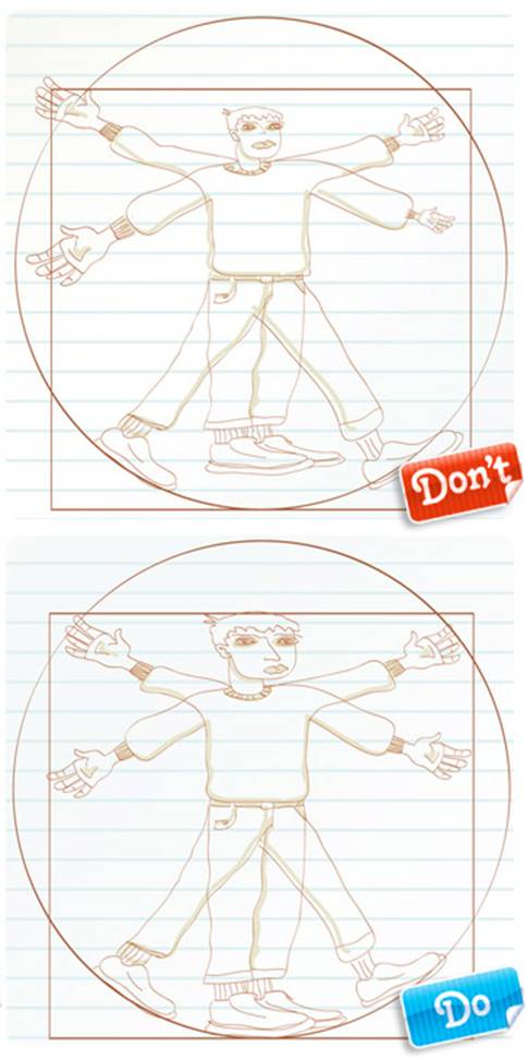
To illustrate this point, consider the classic proportions of the human body.
The first illustration shows various violations of proportions. An unrealistically small head, arms, and legs of varying lengths and sizes; the figure appears foolish. The author clearly hasn’t considered classic proportions.
The second illustration, despite strong stylization, retains the basic proportions of the human body. The limbs are of the necessary length, and the arms, furthermore, are of corresponding size (remember, a human palm is approximately the same size as a face).
The second illustration is an excellent example of creating a stylized figure based on the foundations of human body proportions.

MORE ABOUT ELEMENTS PROPORTIONS
It’s quite common to have small errors in works, such as misplaced layers, incorrect perspective, or poor proportions, that can significantly affect the outcome of your image. Before adding various details to your illustration, pause and closely examine the basic shapes.
Are all objects correctly fitted into perspective? Are all shapes placed on the correct layers? How do the proportions appear? The main task is to identify problem areas before finishing your work.
To illustrate this situation, consider the first example: good colors, decent composition, a demanded concept. But the proportions of the lady undermine all the positives.
The lady’s legs are of different lengths and widths, and her ankles, elbows, wrists, and knees have unnatural angular shapes. The lady appears simply awful.
It’s almost unbelievable how she manages to hold a glass where gravity has no effect on its contents. Even good lighting and shadows do not save this poor lady.
And here’s the second, “correct” example: the same background, the same details, the same drawing… But look how favorably the figure with good proportions stands out! The limbs are bent correctly and naturally, and there is an excellent balance between sharp angles and smooth lines.
The figure’s proportions are accurate, and it remains to add the final details.

WORKING WITH ONE BUTTON?
Most filters in Photoshop and Illustrator are activated by pressing just one button. Listing all the various effects offered by these applications would take a lot of time. Distorting and stylizing filters can save you a significant amount of time, but you need to apply such filters wisely.
Moreover, you’re unlikely to create a good stock vector illustration with filters alone, and buyers on stock platforms are not eager to pay for something that anyone could do easily. Therefore, for now, set the filters aside until you learn to draw with a pen properly.

ON DESIGNING
To create a good vector illustration, you should not forget preliminary planning. First, sit down with a pencil and a piece of paper and envision what you want to achieve and how your illustration should look in the end.
Sketching your illustration beforehand can help prevent potential issues. It is much easier to correct mistakes on paper than to sift through a finished illustration. Preliminary sketches enable you to experiment with composition before you begin working in Illustrator.
To demonstrate the importance of design, take a look at the first illustration. It suffers from a lack of design. Useless gradients are used everywhere, elements are unfinished, different stroke thicknesses are applied, and some similar elements don’t even have outlines.
From a compositional standpoint, the objects are placed chaotically, with no perspective adhered to.
In the second illustration, all the elements that contributed to the image’s disorder and confusion have been removed. As a result, a clear and striking composition was created. Gradients are used minimally, and more attention is paid to details.
Everything is neatly aligned.
The curves are smooth. The colors are selected to evoke the mood of the image, reminiscent of classic space-themed illustrations, and the outlines have been entirely removed. In this image, perspective is maintained.
The planet’s craters are rendered according to this perspective. They enhance the composition’s integrity, realism, and depth.

STYLISTICITY OF THE ILLUSTRATION
Many techniques can add a unique style that belongs only to you in your illustration. An unforgettable effect is achieved through the combination of means: color palette, type of stroke, complexity of graphic execution, light and shadow solutions, and textures.
The difficulty lies in selecting an appropriate style and maintaining it in your work. Mixing and combining styles can quickly lead a designer to a dead end, where professional help becomes necessary.
In the first example, all characters are charming; however, stylistically, they do not match each other at all. In one spot, we have ordinary cartoon ladies in the background, a gothic lady in striped stockings with thick black outlines, a realistic businessman, and a beautifully drawn cartoon girl in the foreground.
This effect disrupts the composition; the elements are disjointed and lack cohesion. Regardless of your efforts to incorporate elements from existing compositions, consider whether they fit into your new composition.
However, the second example is well-executed and consistent in style. All the characters are simple, geometric, and angular. All the colors in the illustration are uniform; there are no gradients or painted light and shadows. The color scheme is built on contrasting warm and cool shades of red and green.
Looking at this drawing, one does not get the impression that someone has arrived at the wrong party.

How to Use Gradients in Vector Illustrations
Once again, we return to the topic of using gradients. Time and again, the works of novice illustrators are rejected by stock platforms due to the use of gradients. Yet people continue to use them without understanding why this happens. This is perhaps the standard mistake of all beginners.
A gradient allows you to quickly and easily achieve depth and volume; with just one click, the surface can appear luminous. It’s only necessary to understand how light falls, and the gradient will be a powerful tool in skilled hands.
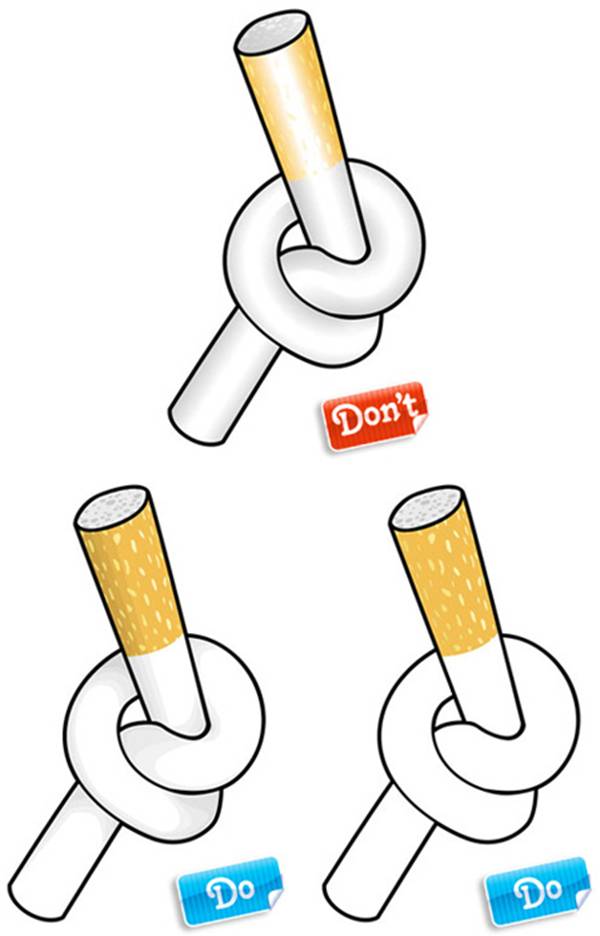
The first illustration could have been a good example of linear technique. However, let’s improve it with a gradient. Unfortunately, it didn’t work out. The gradient appears unattractive here.
Often, when a gradient transitions from a bright, saturated color to white or black, the end result appears rough and cheap. With such a contrasting gradient, the cigarette filter appears unappealing.
Moreover, the filter is made of paper, not chrome. On the white part of the cigarette, the gradient appears more appropriate. Here the contrast isn’t as harsh.
However, despite this, the gradient does not suit the style of the image due to its thick outline. Additionally, the Ministry of Health warns against this.
In the second and third illustrations, the outline remains the same, while only the technique for coloring the elements changes. The example on the right has simple solid fills. In the central example, light shading is used to depict volume and depth.
This is the most optimal for the illustration style.

Let’s look at another example of using gradients. In the first image, we have a linear illustration that we attempted to transform into something entirely non-linear using gradients. Gradients can be used to create a chrome effect, but not in our situation.
Once again, the gradient stretch appears too harsh and unnatural. The transitions are unreasonably sharp at the edges of the castle. There’s one more thing that makes our illustration resemble cheap clip art from the ’80s. It’s the technique used for the lock’s crossbar.
The gradient of the main element shifts from dark to light, moving from bottom to top, while the shaded areas do the opposite. And what’s going on with that crooked gradient at the end of the lock?
In the second illustration, all gradients have been replaced with solid fills. These fills turned out to be the most effective and suitable for this illustration, which is executed in such a technique.
The upper part of the lock has enough highlights and shadows to convey volume, and they are all obtained exclusively with solid fills.

GRADIENT + OUTLINE + HIGHLIGHTS. OOPS! (Spotblind)
In the search for your style, it’s easy to get carried away and waste a lot of time. You can endlessly add new strokes, textures, gradients, patterns. You might wonder, ‘Why limit myself to just one effect?’
But it all depends on their combination. This combination is subtle, and the more unnecessary elements you add, the more jarring the result becomes. This is a key aspect that shouldn’t be forgotten when creating works for microstocks. Often, distracting and competing effects can significantly hinder the buyer’s ability to discern the valuable idea in your illustration that they would want to purchase.
When designing your future illustration, it is essential to determine what the final result should be. Think about what you ultimately want to achieve, try to define what goal you want to accomplish.
Should your illustration be bright, rich, and clear, or, on the contrary, delicate and soft? Funny, simply cute, or serious and moving? After you determine your task, all the elements you create should serve your intention. However, you can always change or adjust the initial idea.
But if you have a clear understanding of what you want to convey to the buyer, the likelihood of achieving a focused and concise result increases dramatically.
The floral theme has been and remains the most popular on photo stocks. The illustration with the flower presented in the first example has quite good quality, but… it could still be just a tad better. For the illustration to compete with the vast number of floral illustrations available in stock collections, it needs to be of the highest quality.
This illustration has clear defects that are immediately obvious. One of the drawbacks is the hard, broken, crooked curls that do not blend at all with the soft and non-contrasting gradients on the petals and leaves. The highlights also leave a negative impression.
They are overly contrasting (perhaps the author was trying to draw a plastic flower). By the way, why are veins drawn on some leaves and not on others? Why are the veins drawn so sloppily? The conclusion is clear, and it’s not promising: bees will never be attracted to this flower!
Now, let’s look at the second illustration of the same flower. In this example, the flower is depicted as one that you could proudly present to a loved one. The dissonant motifs have been removed. A large number of mismatched and unclear leaves have been eliminated.
They have simply been replaced with two specific and clear leaves, drawn in the same style. The soft coloring creates a subtle hint of volume and depth. Harsh gradients and contrasting highlights have been softened.
Additional elements with soft gradients were added to each petal of the flower. These elements give a three-dimensional effect. So, how does it smell?
Can you smell the delicate scent of the flower?

AND IN CONCLUSION, I’LL SAY…
As the old saying goes, ‘A picture is worth a thousand words.’ And I believe there’s nothing more to add. Illustrations speak for themselves; you just have to look at them…


Source of materials in preparing the article – www.istockphoto.com/article_view.php?ID=367
This article is available in the following categories: About Microstocks


